我想要说
今天,学习了 RadioButton 组件。以及 RadioGroup 组件的实现单选功能
以及自定义的单选样式。
还有使用 setOnCheckedChangeListener 用来监听哪个单选按钮是被选中的。
实例
简单的单选按钮
单选按钮的创建非常简单,使用 RadioButton 组件即可。
<?xml version="1.0" encoding="utf-8"?>
<LinearLayout xmlns:android="http://schemas.android.com/apk/res/android"
xmlns:tools="http://schemas.android.com/tools"
android:layout_width="match_parent"
android:layout_height="match_parent"
tools:context="top.bestguo.androidlayout.RadioButtonActivity">
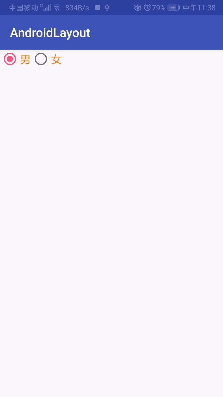
<RadioButton
android:id="@+id/rb1"
android:layout_width="match_parent"
android:layout_height="30dp"
android:text="男"
android:textColor="#ff6600"
android:textSize="18sp"/>
</LinearLayout>效果如下
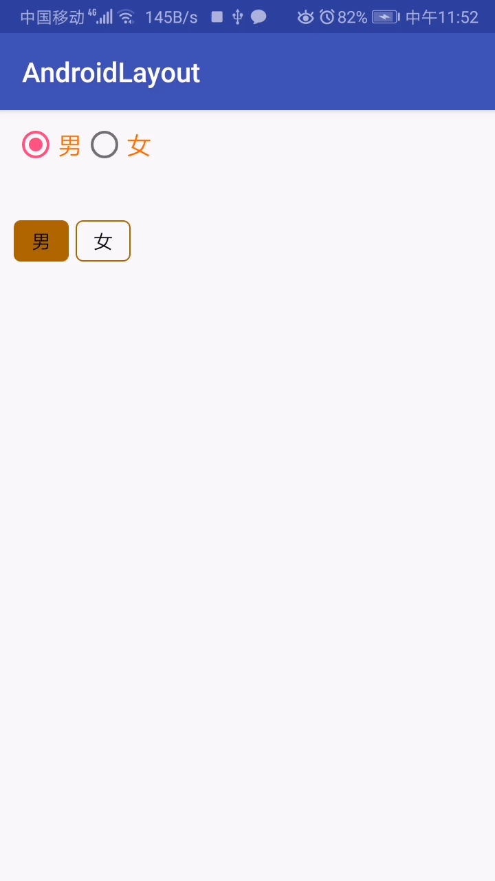
使用按钮组
由于单选按钮是有多个,需要将这些单选按钮放到一个单选按钮组 RadioGroup ,来实现单选的效果。
单选按钮组中,有设置按钮的摆放顺序的属性。即 orientation 属性,有两个值 horizontal 和 vertical
以下实例中设置的是水平摆放,单选按钮组默认设置的是竖直的摆放方式。
当然,在按钮组中,可以设置其中的一个按钮是否已经选中,选中的属性为 checked ,true为选中,false 为未选中。
也可以决定禁用该按钮,通过设置 enable 属性来设置该按钮是否能选,true 为可选,false 为不可选。
<?xml version="1.0" encoding="utf-8"?>
<LinearLayout xmlns:android="http://schemas.android.com/apk/res/android"
    xmlns:tools="http://schemas.android.com/tools"
    android:layout_width="match_parent"
    android:layout_height="match_parent"
    tools:context="top.bestguo.androidlayout.RadioButtonActivity">

    <RadioGroup
        android:id="@+id/rg1"
        android:layout_width="wrap_content"
        android:layout_height="wrap_content"
        android:orientation="horizontal">

        <!-- 设置选中 -->
        <RadioButton
            android:id="@+id/rb1"
            android:layout_width="match_parent"
            android:layout_height="30dp"
            android:text="男"
            android:textColor="#ff6600"
            android:textSize="18sp"
            android:checked="true"/>

        <RadioButton
            android:id="@+id/rb2"
            android:layout_width="match_parent"
            android:layout_height="30dp"
            android:text="女"
            android:textColor="#ff6600"
            android:textSize="18sp"/>

    </RadioGroup>

</LinearLayout>
效果如下
自定义单选样式
和前面设置按钮一样,也可以自定义属于自己的单选按钮效果。
在自定义单选按钮效果时,可以考虑将默认的单选按钮的圆圈给去除。去除的属性为 button="@null" 这样样式就不会展示出来。
radio_button.xml 文件样式代码
<?xml version="1.0" encoding="utf-8"?>
<selector xmlns:android="http://schemas.android.com/apk/res/android">
    <item android:state_checked="true">
        <shape>
            <solid android:color="#a60"/>
            <corners android:radius="5dp"/>
        </shape>
    </item>
    <item android:state_checked="false">
        <shape>

            <stroke
                android:color="#a60"
                android:width="1dp"/>

            <corners
                android:radius="5dp"/>
        </shape>
    </item>
</selector>
以上的样式代码,由于是否选中。所以 item 中的判断规则为 state_checked
自定义单选框的代码
<?xml version="1.0" encoding="utf-8"?>
<LinearLayout xmlns:android="http://schemas.android.com/apk/res/android"
    xmlns:tools="http://schemas.android.com/tools"
    android:layout_width="match_parent"
    android:layout_height="match_parent"
    tools:context="top.bestguo.androidlayout.RadioButtonActivity"
    android:orientation="vertical"
    android:padding="10dp">

    <RadioGroup
        android:layout_width="wrap_content"
        android:layout_height="wrap_content"
        android:layout_marginTop="40dp"
        android:orientation="horizontal">

        <RadioButton
            android:id="@+id/rb3"
            android:layout_width="40dp"
            android:layout_height="30dp"
            android:background="@drawable/radio_button"
            android:text="男"
            android:checked="true"
            android:button="@null"
            android:textAlignment="center"/>

        <RadioButton
            android:id="@+id/rb4"
            android:layout_width="40dp"
            android:layout_height="30dp"
            android:background="@drawable/radio_button"
            android:text="女"
            android:button="@null"
            android:textAlignment="center"
            android:layout_marginLeft="5dp"/>

    </RadioGroup>

</LinearLayout>
效果如下
事件
按钮和按钮组都有单独的事件。为了监听哪个按钮被选中,那么需要监听按钮组,来监听是哪个按钮被选中的状态。
通过 setOnCheckedChangeListener 这个方法来监听哪个被选中。
package top.bestguo.androidlayout;

import android.support.annotation.IdRes;
import android.support.v7.app.AppCompatActivity;
import android.os.Bundle;
import android.widget.RadioButton;
import android.widget.RadioGroup;
import android.widget.Toast;

public class RadioButtonActivity extends AppCompatActivity {

    private RadioGroup rg1;

    @Override
    protected void onCreate(Bundle savedInstanceState) {
        super.onCreate(savedInstanceState);
        setContentView(R.layout.activity_radio_button);

        rg1 = (RadioGroup) findViewById(R.id.rg1);
        // 设置 setOnCheckedChangeListener 监听事件
        rg1.setOnCheckedChangeListener(new RadioGroup.OnCheckedChangeListener() {
            @Override
            public void onCheckedChanged(RadioGroup radioGroup, @IdRes int i) {
                // 获取某个单选按钮的 id ,就像是之前通过 id 来获取按钮、文本框等组件时一样的
                // 只不过这里单选按钮的 id 是通过发生的事件来传递过来的。
                RadioButton radioButton = radioGroup.findViewById(i);
                Toast.makeText(RadioButtonActivity.this, "点击了“" + radioButton.getText() + "”", Toast.LENGTH_SHORT).show();
            }
        });
    }
}
效果如下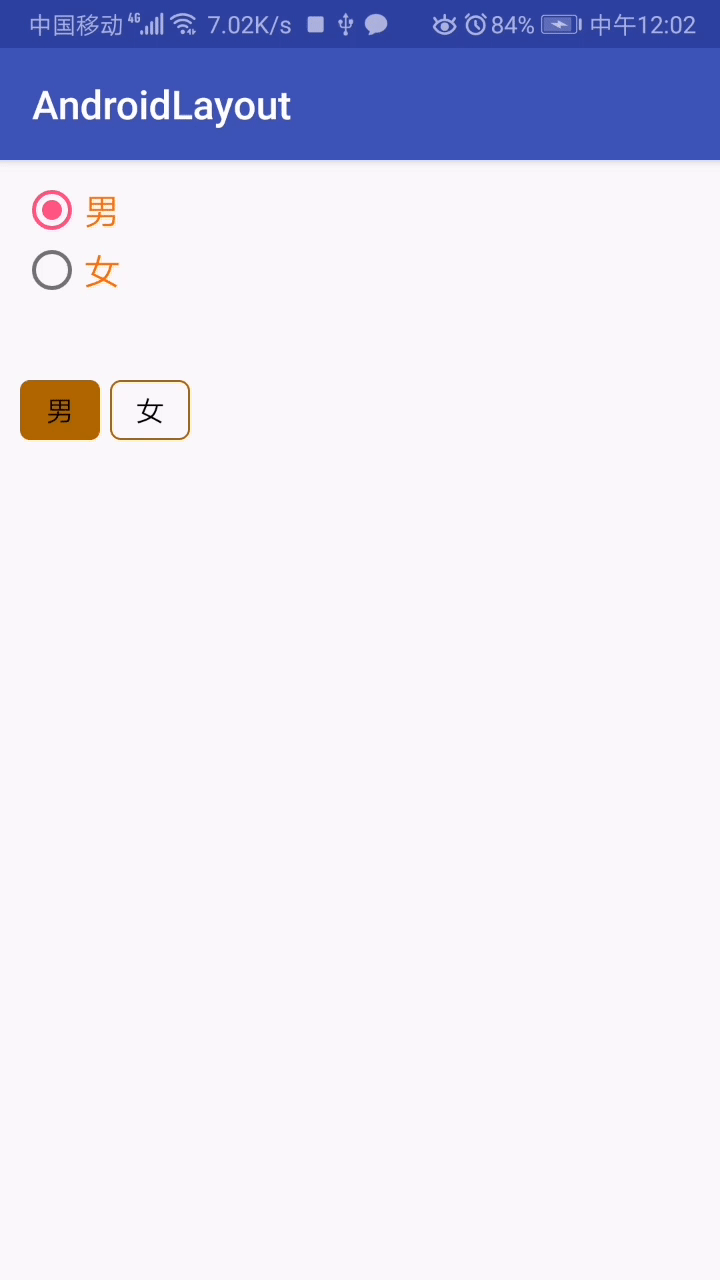
效果图的第一个按钮组是竖直的原因,是因为我将 orientation 的属性删除了,所以就变成里竖直的状态。😊😊
请勿发布违反中国大陆地区法律的言论,请勿人身攻击、谩骂、侮辱和煽动式的语言。