ConstraintLayout,即约束布局。
ConstraintLayout 最早发布的那一年是在 2016 年,现在距今也有 5 年了吧。我们老师一开始教的布局就是 ConstraintLayout 布局,这个布局是可以用鼠标进行拖拽控件来对界面进行布局。但是,它可不是像 UI 原型设计那样随便就可以拖拽的,是需要学习的,这也是我刚刚学习新布局的一个巨坑。
在没有 ConstraintLayout 布局出现之前,用的很多的就是 RelativeLayout 了,也就是相对布局。我之前写的那些日志都是基于此来进行布局,是需要进行大量的打代码来对组件的位置进行一个定位,但是不难。而 ConstraintLayout 虽然可以拖拽,但它可是这里面最复杂的布局了。
刚开始学真的难,但是能够真正的掌握正确的拖拽方式就真的很香。(我小赫赫就是用饿死,死外面从这跳下去也不会学约束布局,啊真香哎呀!)
为什么要使用约束布局
约束布局其实解决的是嵌套过多的问题,嵌套过多,加载时间就会越久。Android 布局的嵌套为什么会这么久,可以把它想象成 for 循环嵌套。毕竟时间复杂度是 O(n^m) 嘛,有嵌套 m 层,时间复杂度就是多少咯。
优点和缺点
所有事物均有优缺点,ConstraintLayout 布局也不例外,以下是我了解到的优点。
优点
- 减少了很多布局嵌套。
- 提升了 app 界面的加载速度。
- 自适应各种屏幕,少花费时间在界面适配上。
以上就是我了解到的优点,接下来就是缺点了。
缺点
- 看似简单的拖拽,其实上手难度较大。
- 代码的可读性差。
开始前提
开学的第一周就把 AndroidStudio 给升级到了最新的 4.1.2 版本,不再使用旧的版本。点击下载新版本,不过使用 4.1.2 之后的版本也行。毕竟新技术更新的实在是太快啦😂😂😂。
开始使用
约束布局中的线性布局和相对布局
其实,ConstraintLayout 是可以当成是线性布局或者相对布局中,它可以替代相对布局,但是线性布局的替代性就没有那么好了,下面的例子就是用来展示布局的。
相对布局
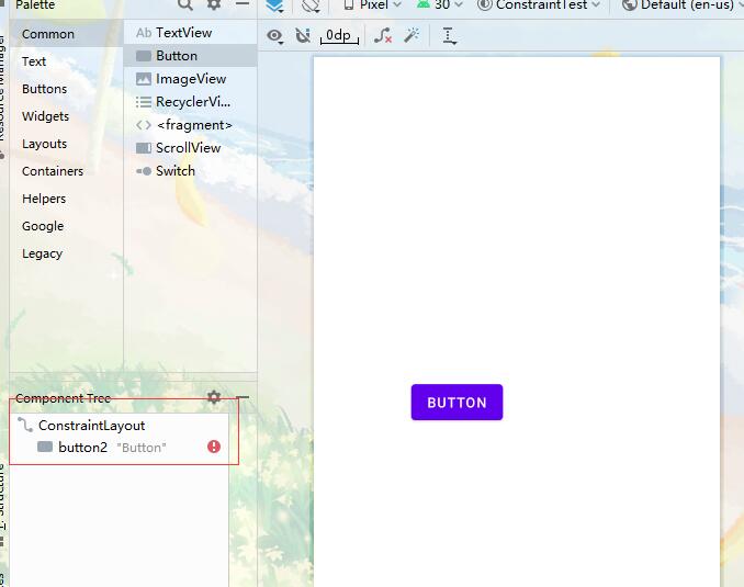
一个按钮
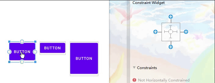
首先拖入一个按钮,由于此时是没有约束的。所以,这个按钮在约束布局中会报错。需要添加约束。
添加约束的方式也非常之简单,如下图所示。拉出来的箭头,就是给按钮设置约束的。
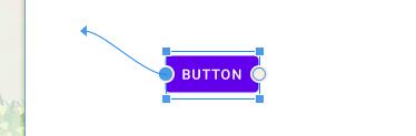
由于需要确定这个按钮所在的位置,所以只要定义两个约束。比如我们设置按钮左边的约束和按钮上面的约束,设置成功之后,按钮组件就在左上角的位置。然后左边也不会报错了。
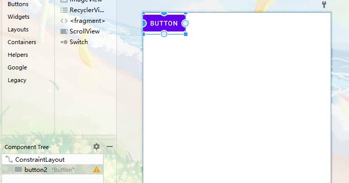
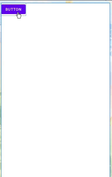
然后这个时候我们可以随便拖动按钮的位置了。
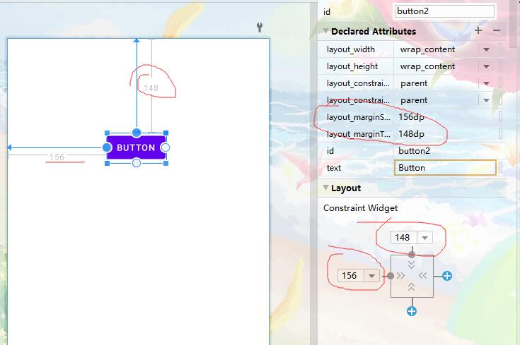
如果需要进行精确的定位,那麽可以通过右边的属性栏和下面的 Layout 定义位置。其实并不能通过这个来将组件的位置来定死,因为这个其实是 layout_marginTop 和 layout_marginStart ,也就是外边距。
所以用它来进行绝对的定位显然不太现实。而且,使用这种定位方式,它不能自定适应屏幕的。
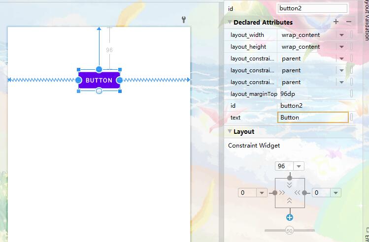
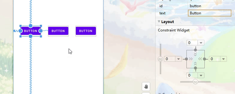
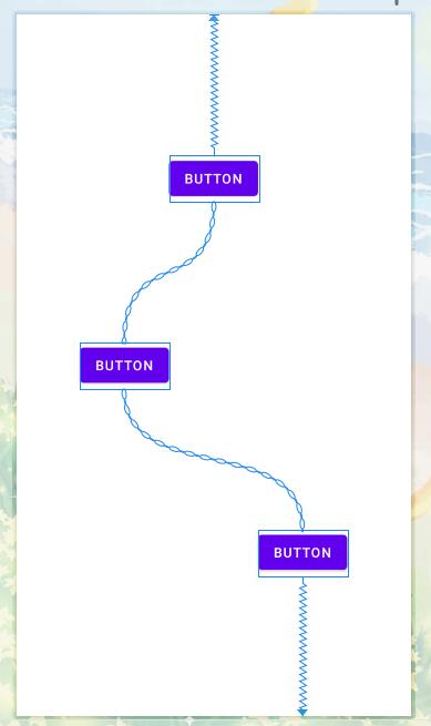
如果我们要然按钮进行水平居中,那怎么办呢?通过上面的方式又不行。那就增加约束,再加一条约束用来约束按钮右边即可,这样就水平居中了。
不过又发现了一个新现象,就是 marginStart 属性不见了,并且箭头变成了“弹簧”的形状。害,突然想起了高中物理。我又想起了胡克定律,F=kx(k 为弹簧的劲度系数,x 为弹簧被拉长的距离)
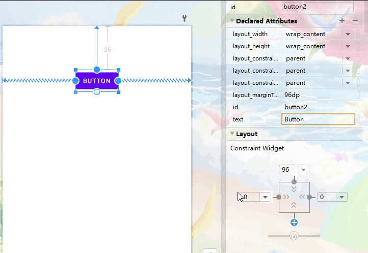
通过上图可知,是因为它们所谓的“劲度系数k”相同才使得这个按钮在水平是居中的。然后 Layout 下面变成了滑块。通过滑块,就相当于是调整两个弹簧的“劲度系数”。也就有如下的结果了。
代码如下
<?xml version="1.0" encoding="utf-8"?>
<androidx.constraintlayout.widget.ConstraintLayout xmlns:android="http://schemas.android.com/apk/res/android"
    xmlns:app="http://schemas.android.com/apk/res-auto"
    xmlns:tools="http://schemas.android.com/tools"
    android:layout_width="match_parent"
    android:layout_height="match_parent"
    tools:context=".MainActivity">

    <Button
        android:id="@+id/button13"
        android:layout_width="wrap_content"
        android:layout_height="wrap_content"
        android:layout_marginTop="56dp"
        android:text="Button"
        app:layout_constraintEnd_toEndOf="parent"
        app:layout_constraintStart_toStartOf="parent"
        app:layout_constraintTop_toTopOf="parent" />

</androidx.constraintlayout.widget.ConstraintLayout>
同理,如果让他垂直居中的话,给按钮底部一个约束即可,同时竖直按钮部分也会给出一个滑块来调整弹簧的“劲度系数”。
多个按钮
以下,我们多放几个按钮,来体验一下真正的相对布局。在实验之前,我把原来的按钮给删除了。重新放置了一些新按钮。然后,我们来玩一玩“虚幻一枪”,来看看其中的效果。
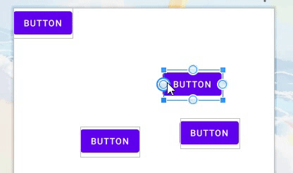
通过这个效果动画,我们发现,只要我们对这个按钮进行约束的时候。他会给你一些提示,来提示连接按钮的哪一边。约束按钮的左边,那么它只能连接其它按钮(或者其它的组件)的左边和右边,或者约束布局容器的左右边。
同理,约束的是上边和下边,那么也只能其它按钮(或者其它的组件)的上边和下边,或者约束布局的上下边。
如果我们要让三个按钮进行上对齐,那么我们这样连接。通过移动的方式发现,当移动到和中间按钮的顶部对齐时发现按钮不能够在向上移动。第三个可以移动的原因是因为没有设置约束。所以它是可以自由移动的,而且会带动其余两个按钮。
代码如下,请注意约束属性 layout_constraintTop_toTopOf
<androidx.constraintlayout.widget.ConstraintLayout xmlns:android="http://schemas.android.com/apk/res/android"
    xmlns:app="http://schemas.android.com/apk/res-auto"
    xmlns:tools="http://schemas.android.com/tools"
    android:layout_width="match_parent"
    android:layout_height="match_parent">

    <Button
        android:id="@+id/button"
        android:layout_width="96dp"
        android:layout_height="82dp"
        android:text="Button"
        app:layout_constraintTop_toTopOf="@+id/button2"
        tools:layout_editor_absoluteX="33dp" />

    <Button
        android:id="@+id/button2"
        android:layout_width="wrap_content"
        android:layout_height="wrap_content"
        android:text="Button"
        app:layout_constraintTop_toTopOf="@+id/button3"
        tools:layout_editor_absoluteX="159dp" />

    <Button
        android:id="@+id/button3"
        android:layout_width="98dp"
        android:layout_height="142dp"
        android:text="Button"
        tools:layout_editor_absoluteX="288dp"
        tools:layout_editor_absoluteY="294dp" />

</androidx.constraintlayout.widget.ConstraintLayout>
如果要让三个按钮进行水平对齐,可以这样去做。当这样连接时三个按钮默认都处于一条水平线上,连接完之后,右边多了一个竖直的滑块,就说明上下两个弹簧的“劲度系数”是可以调的,可以使它们不在同一条水平线上。同理,也可以使它们在垂直线上。
相关代码如下:
<androidx.constraintlayout.widget.ConstraintLayout xmlns:android="http://schemas.android.com/apk/res/android"
xmlns:app="http://schemas.android.com/apk/res-auto"
xmlns:tools="http://schemas.android.com/tools"
android:layout_width="match_parent"
android:layout_height="match_parent">

<Button
    android:id="@+id/button"
    android:layout_width="96dp"
    android:layout_height="82dp"
    android:text="Button"
    app:layout_constraintBottom_toBottomOf="@+id/button2"
    app:layout_constraintTop_toTopOf="@+id/button2"
    app:layout_constraintVertical_bias="0.62"
    tools:layout_editor_absoluteX="33dp" />

<Button
    android:id="@+id/button2"
    android:layout_width="wrap_content"
    android:layout_height="wrap_content"
    android:text="Button"
    app:layout_constraintBottom_toBottomOf="@+id/button3"
    app:layout_constraintTop_toTopOf="@+id/button3"
    app:layout_constraintVertical_bias="0.53"
    tools:layout_editor_absoluteX="159dp" />

<Button
    android:id="@+id/button3"
    android:layout_width="98dp"
    android:layout_height="142dp"
    android:text="Button"
    tools:layout_editor_absoluteX="288dp"
    tools:layout_editor_absoluteY="294dp" />

</androidx.constraintlayout.widget.ConstraintLayout>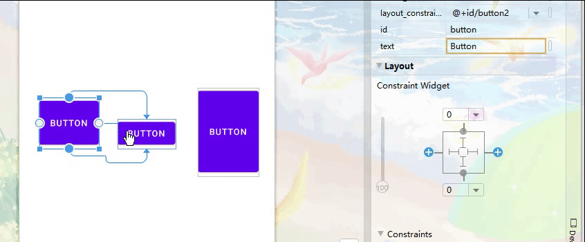
总结
相对布局的定位目标仅仅是其它组件的,而约束布局可以精确到其他组件的边。而且比起相对布局确实强化了不少。在以上的操作中,总共利用到了 12 种属性。
- layout_constraintLeft_toLeftOf:这个组件的左边连接到另一个组件的左边
- layout_constraintLeft_toRightOf:这个组件的左边连接到另一个组件的右边
- layout_constraintRight_toLeftOf:这个组件的右边连接到另一个组件的左边
- layout_constraintRight_toRightOf:这个组件的右边连接到另一个组件的右边
- layout_constraintTop_toTopOf:这个组件的上边连接到另一个组件的上边
- layout_constraintTop_toBottomOf:这个组件的上边连接到另一个组件的下边
- layout_constraintBottom_toTopOf:这个组件的下边连接到另一个组件的上边
- layout_constraintBottom_toBottomOf:这个组件的下边连接到另一个组件的下边
- layout_constraintStart_toEndOf:同 layout_constraintLeft_toRightOf
- layout_constraintStart_toStartOf:同 layout_constraintLeft_toLeftOf
- layout_constraintEnd_toStartOf:同 layout_constraintRight_toLeftOf
- layout_constraintEnd_toEndOf:同 layout_constraintRight_toRightOf
还有一种是基于文本基线的方式
- layout_constraintBaseline_toBaselineOf
设置弹簧“劲度系数”的属性
- layout_constraintVertical_bias
线性布局
在约束布局当中,如果要实现类似于线性布局的方式。可以使用 Chain 来将这些组件来连接起来。连接的动画如下。当连接起来之后,发现这三个组件的连接方式通过一条铁链的方式连接起来了,而不是之前的弹簧。
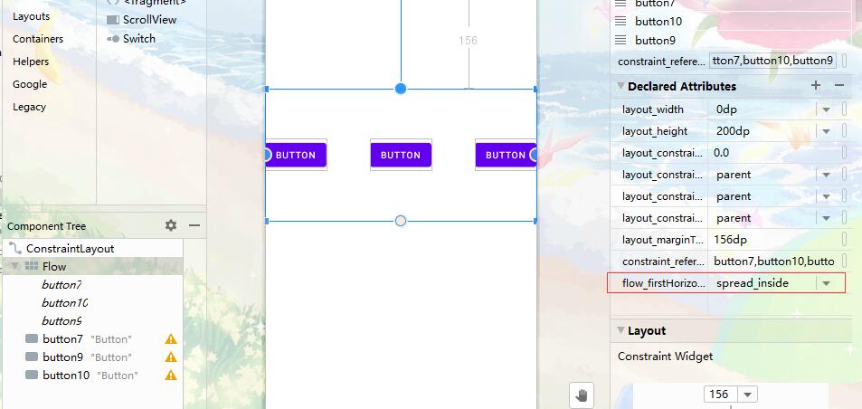
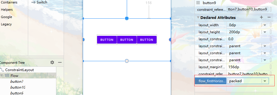
总共有三种方式:spread,spread_inside 和 packed,分别演示
三种方式的代码,在全选按钮选择 Chain 的时候,代码中的操作其实就是给第一个按钮设置了 app:layout_constraintHorizontal_chainStyle 属性,这样就会有链条这种效果了。不写默认为 spread。
使用 spread 的代码。
<?xml version="1.0" encoding="utf-8"?>
<androidx.constraintlayout.widget.ConstraintLayout xmlns:android="http://schemas.android.com/apk/res/android"
    xmlns:app="http://schemas.android.com/apk/res-auto"
    xmlns:tools="http://schemas.android.com/tools"
    android:layout_width="match_parent"
    android:layout_height="match_parent">

    <Button
        android:id="@+id/button"
        android:layout_width="wrap_content"
        android:layout_height="wrap_content"
        android:text="Button"
        app:layout_constraintBottom_toBottomOf="parent"
        app:layout_constraintEnd_toStartOf="@+id/button2"
        app:layout_constraintHorizontal_bias="0.5"
        app:layout_constraintHorizontal_chainStyle="spread"
        app:layout_constraintStart_toStartOf="parent"
        app:layout_constraintTop_toTopOf="parent" />

    <Button
        android:id="@+id/button2"
        android:layout_width="wrap_content"
        android:layout_height="wrap_content"
        android:text="Button"
        app:layout_constraintBottom_toBottomOf="parent"
        app:layout_constraintEnd_toStartOf="@+id/button3"
        app:layout_constraintHorizontal_bias="0.5"
        app:layout_constraintStart_toEndOf="@+id/button"
        app:layout_constraintTop_toTopOf="parent" />

    <Button
        android:id="@+id/button3"
        android:layout_width="wrap_content"
        android:layout_height="wrap_content"
        android:text="Button"
        app:layout_constraintBottom_toBottomOf="parent"
        app:layout_constraintEnd_toEndOf="parent"
        app:layout_constraintHorizontal_bias="0.5"
        app:layout_constraintStart_toEndOf="@+id/button2"
        app:layout_constraintTop_toTopOf="parent" />

</androidx.constraintlayout.widget.ConstraintLayout>
使用 spread_inside ,也就是最左端和最右端紧靠约束布局边缘。
<?xml version="1.0" encoding="utf-8"?>
<androidx.constraintlayout.widget.ConstraintLayout xmlns:android="http://schemas.android.com/apk/res/android"
    xmlns:app="http://schemas.android.com/apk/res-auto"
    xmlns:tools="http://schemas.android.com/tools"
    android:layout_width="match_parent"
    android:layout_height="match_parent">

    <Button
        android:id="@+id/button"
        android:layout_width="wrap_content"
        android:layout_height="wrap_content"
        android:text="Button"
        app:layout_constraintBottom_toBottomOf="parent"
        app:layout_constraintEnd_toStartOf="@+id/button2"
        app:layout_constraintHorizontal_bias="0.5"
        app:layout_constraintHorizontal_chainStyle="spread_inside"
        app:layout_constraintStart_toStartOf="parent"
        app:layout_constraintTop_toTopOf="parent" />

    <!-- 其它两个按钮省略 -->
    ......

</androidx.constraintlayout.widget.ConstraintLayout>
使用 packed ,将三个元素紧靠在一起。
<?xml version="1.0" encoding="utf-8"?>
<androidx.constraintlayout.widget.ConstraintLayout xmlns:android="http://schemas.android.com/apk/res/android"
    xmlns:app="http://schemas.android.com/apk/res-auto"
    xmlns:tools="http://schemas.android.com/tools"
    android:layout_width="match_parent"
    android:layout_height="match_parent">

    <Button
        android:id="@+id/button"
        android:layout_width="wrap_content"
        android:layout_height="wrap_content"
        android:text="Button"
        app:layout_constraintBottom_toBottomOf="parent"
        app:layout_constraintEnd_toStartOf="@+id/button2"
        app:layout_constraintHorizontal_bias="0.5"
        app:layout_constraintHorizontal_chainStyle="packed"
        app:layout_constraintStart_toStartOf="parent"
        app:layout_constraintTop_toTopOf="parent" />

    <!-- 其它两个按钮省略 -->
    ......

</androidx.constraintlayout.widget.ConstraintLayout>
除此之外,还可以单独的设置垂直的链接方式,点击 Create vertical chain 即可。垂直方式也有以上三种这种方式,分别为:spread,spread_inside 和 packed。
有的时候,使用链条的这种方式,用 Helpers 中的 Flow 这种流式虚拟布局来进行替代。
各种 Helper
helper 是用在约束布局用来进行辅助作用的,通过这些辅助的东西,就可以做出一些复杂的布局了。反正我是觉得,单纯的只用约束布局的那些属性,要是做出复杂的布局是很难的。这些 Helper 也是利用拖拽的方式就可以轻松完成了
Helper 的种类有很多,比如 Group(组)、Barrier(活动的隔板)、Flow(流式)、Guideline(指导线)、Layer(层布局)、ImageFilterButton、ImageFilterVIew、Mock(熟悉的原型设计)
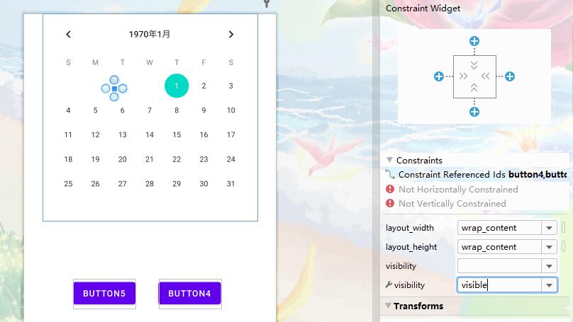
Group
由于约束布局中是没有那种层级的关系,在开发的时候会比较混乱。将几个相关联组件放入到这个逻辑的组中,就感觉界面上有那种层级的关系,便于管理。
比如后面用到的 Flow 和 Layer ,这些感觉在看似在代码中能体现来,其实并没有嵌套。它仅仅是在界面上可以体现出来。
使用方法也非常简单,只要将界面的中的组件拖动到 Group 中即可。但是,拖进去之后还需要对这些组件来进行约束。
而且,添加进去之后,Group 里面并没有将内容填充进去,这也和下面的 Flow 有区别。

目前在学习使用 Group 的时候,学习到了将组中的空间进行隐藏和显示。
这是 visibility 属性设置成 enable 的时候展示的。
代码如下:
<?xml version="1.0" encoding="utf-8"?>
<androidx.constraintlayout.widget.ConstraintLayout
    xmlns:android="http://schemas.android.com/apk/res/android"
    xmlns:app="http://schemas.android.com/apk/res-auto"
    xmlns:tools="http://schemas.android.com/tools"
    android:layout_width="match_parent"
    android:layout_height="match_parent">

    <Button
        android:id="@+id/button4"
        android:layout_width="wrap_content"
        android:layout_height="wrap_content"
        android:text="Button4"
        tools:layout_editor_absoluteX="220dp"
        tools:layout_editor_absoluteY="433dp" />

    <Button
        android:id="@+id/button5"
        android:layout_width="wrap_content"
        android:layout_height="wrap_content"
        android:text="Button5"
        tools:layout_editor_absoluteX="81dp"
        tools:layout_editor_absoluteY="433dp" />

    <CalendarView
        android:id="@+id/calendarView"
        android:layout_width="wrap_content"
        android:layout_height="wrap_content"
        app:layout_constraintEnd_toEndOf="parent"
        app:layout_constraintStart_toStartOf="parent"
        app:layout_constraintTop_toTopOf="parent" />

    <androidx.constraintlayout.widget.Group
        android:layout_width="wrap_content"
        android:layout_height="wrap_content"
        app:constraint_referenced_ids="button4,button5,calendarView"
        tools:layout_editor_absoluteX="148dp"
        tools:layout_editor_absoluteY="122dp"
        tools:visibility="visible" />

</androidx.constraintlayout.widget.ConstraintLayout>
同理,对应的 invisible 和 gone 对应的效果就是不显示和隐藏。
Guideline
Guideline 是向导线,其实就是辅助线的意思啦。通过辅助现将屏幕划成几份,然后再使用约束布局,约束布局的指向就可以指到辅助线上了。
辅助线在界面设计时可见,在运行时是看不见的。
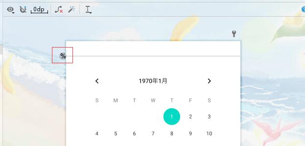
红色圈圈部分可以修改,通过鼠标的点击,可以调成百分比。总共有三种方式,一个是距离屏幕顶部的距离,一个是距离屏幕底部的距离,最后一个是屏幕距离顶部的百分比。最后一个用百分比就很常用,通过百分比的设置可以自由适配屏幕了。
这是距离顶部的
这是距离底部的
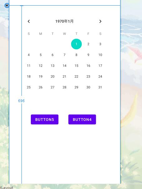
这是距离顶部的百分比
同理,水平方式也是如此。
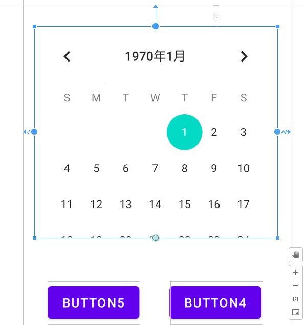
将组件指向 Guideline,看到了弹簧指向了辅助线。
Guideline 相关代码如下:
<?xml version="1.0" encoding="utf-8"?>
<androidx.constraintlayout.widget.ConstraintLayout
    xmlns:android="http://schemas.android.com/apk/res/android"
    xmlns:app="http://schemas.android.com/apk/res-auto"
    xmlns:tools="http://schemas.android.com/tools"
    android:layout_width="match_parent"
    android:layout_height="match_parent">

    <Button
        android:id="@+id/button4"
        android:layout_width="wrap_content"
        android:layout_height="wrap_content"
        android:layout_marginTop="48dp"
        android:layout_marginEnd="32dp"
        android:text="Button4"
        app:layout_constraintEnd_toStartOf="@+id/guideline3"
        app:layout_constraintTop_toBottomOf="@+id/calendarView" />

    <Button
        android:id="@+id/button5"
        android:layout_width="wrap_content"
        android:layout_height="wrap_content"
        android:layout_marginStart="28dp"
        android:layout_marginTop="48dp"
        android:text="Button5"
        app:layout_constraintStart_toStartOf="@+id/guideline2"
        app:layout_constraintTop_toBottomOf="@+id/calendarView" />

    <CalendarView
        android:id="@+id/calendarView"
        android:layout_width="266dp"
        android:layout_height="243dp"
        android:layout_marginTop="24dp"
        app:layout_constraintEnd_toStartOf="@+id/guideline3"
        app:layout_constraintHorizontal_bias="0.464"
        app:layout_constraintStart_toStartOf="@+id/guideline2"
        app:layout_constraintTop_toTopOf="@+id/guideline" />

    <androidx.constraintlayout.widget.Group
        android:layout_width="wrap_content"
        android:layout_height="wrap_content"
        android:visibility="visible"
        app:constraint_referenced_ids="button4,button5,calendarView"
        tools:layout_editor_absoluteX="148dp"
        tools:layout_editor_absoluteY="122dp"
        tools:visibility="visible" />

    <androidx.constraintlayout.widget.Guideline
        android:id="@+id/guideline"
        android:layout_width="wrap_content"
        android:layout_height="wrap_content"
        android:orientation="horizontal"
        app:layout_constraintGuide_percent="0.047879618" />

    <androidx.constraintlayout.widget.Guideline
        android:id="@+id/guideline2"
        android:layout_width="wrap_content"
        android:layout_height="wrap_content"
        android:orientation="vertical"
        app:layout_constraintGuide_end="355dp" />

    <androidx.constraintlayout.widget.Guideline
        android:id="@+id/guideline3"
        android:layout_width="wrap_content"
        android:layout_height="wrap_content"
        android:orientation="vertical"
        app:layout_constraintGuide_begin="355dp" />

</androidx.constraintlayout.widget.ConstraintLayout>
Barrier
和 Guideline 不一样,它是一种隔板,将左右或者上下两边的控件进行隔开,使用方法也非常之简单。Barrier 用于解决在约束布局中由于宽度过宽导致组件被覆盖的情况。不过我在将按钮约束至隔板上面好像不行,需要手动来打约束的代码才可以。
这是未使用隔板,右下方的按钮被覆盖了。
这是已使用隔板的,下方的按钮被隔板约束着没有被覆盖掉,而是随着隔板向下移动了。
相关的代码如下
<?xml version="1.0" encoding="utf-8"?>
<androidx.constraintlayout.widget.ConstraintLayout
    xmlns:android="http://schemas.android.com/apk/res/android"
    xmlns:app="http://schemas.android.com/apk/res-auto"
    xmlns:tools="http://schemas.android.com/tools"
    android:layout_width="match_parent"
    android:layout_height="match_parent">

	<androidx.constraintlayout.widget.Barrier
        android:id="@+id/barrier"
        android:layout_width="wrap_content"
        android:layout_height="wrap_content"
        app:barrierAllowsGoneWidgets="false"
        app:barrierDirection="bottom"
        app:constraint_referenced_ids="button6,button8"
        tools:layout_editor_absoluteX="67dp"
        tools:layout_editor_absoluteY="160dp" />

    <Button
        android:id="@+id/button6"
        android:layout_width="wrap_content"
        android:layout_height="wrap_content"
        android:text="Button"
        tools:layout_editor_absoluteX="137dp"
        tools:layout_editor_absoluteY="518dp" />

    <Button
        android:id="@+id/button8"
        android:layout_width="82dp"
        android:layout_height="172dp"
        android:text="Button"
        tools:layout_editor_absoluteX="272dp"
        tools:layout_editor_absoluteY="470dp" />

    <Button
        android:id="@+id/button9"
        android:layout_width="wrap_content"
        android:layout_height="wrap_content"
        android:layout_marginTop="28dp"
        android:text="Button"
        app:layout_constraintTop_toBottomOf="@id/barrier"
        tools:layout_editor_absoluteX="148dp" />

</androidx.constraintlayout.widget.ConstraintLayout>
Flow
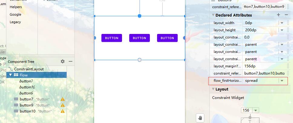
Flow 虚拟布局和将三个组件通过铁链连起来的部分效果是一样的,属性值也是一样的,属性名就不一样,Flow 布局中有一个特有的属性就是 flow_horizontalStyle 。
当属性值为 spread_inside 的时候
当属性为 packed 的时候
当属性为 spread 的时候
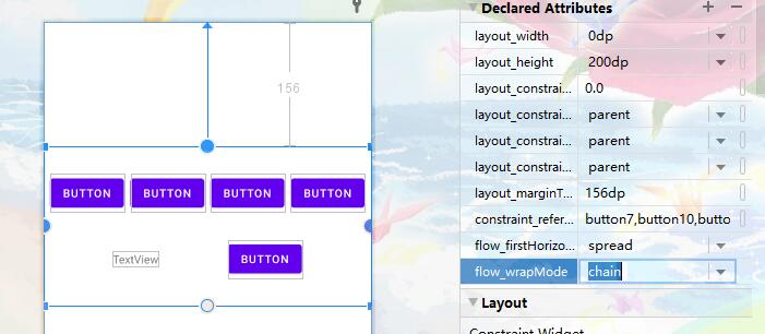
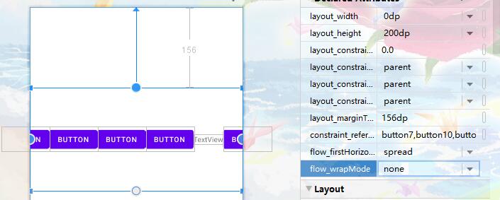
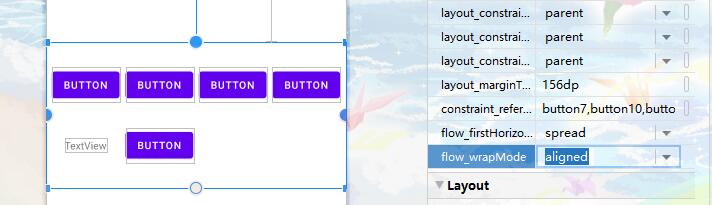
如果水平内容满了,需要接到下一行,此时可以利用这个属性 flow_wrap,这个属性共有三种值:align、chain、none 三种值。none 值是不换行的。
当属性值为 chain 的时候
当属性值为 none 的时候,也就是默认的
当属性值为 aligned 的时候
未完待续,后面学习到再补充补充……

后记
除了在课上学习约束布局及其相关的组件之后,还参考了以下资料
请勿发布违反中国大陆地区法律的言论,请勿人身攻击、谩骂、侮辱和煽动式的语言。